 Are you doing everything possible to optimize your landing pages for conversions? If you’re looking for advice we’d highly recommend the landing page Master Chef herself, Jennifer Pepper! Jennifer leads content marketing over at Unbounce and was kind enough to speak at Experience Inbound 2019.
In her tactical breakout session, she covered several points about improving business through high-converting landing pages. We’ve put together a summary of her breakout session and helpful tips and tricks she walked through below.
Getting Started: A Blast to the Past
Before we dive into the steps you can take to improve your business through high-converting landing pages, we must first dive into the past!
Back in 2005, the average cost per click was a measly $0.38 cents. Jump to 2008 and that cost rose to $0.71 cents. Today, returns have diminished considerably, and it’s only going to become more costly as more and more marketers flood the ad space.
Knowing this, it becomes abundantly clear that the fundamentals are more important than ever when creating a successful landing page. If you’re spending all this money to get qualified leads to your page, you want to be sure they are going to convert.
So let’s get down to the nitty-gritty.
Building The Perfect Lead-Generating Form On Your Landing Page
A common mistake many marketers make on their landing pages is that they create a massive form. Asking for this much personal information right off the bat can cause a lot of friction, unless you are a super well-known brand customers have a lot of trust in.
The key to collecting more information in a less intimidating way is to create a multi-step from.
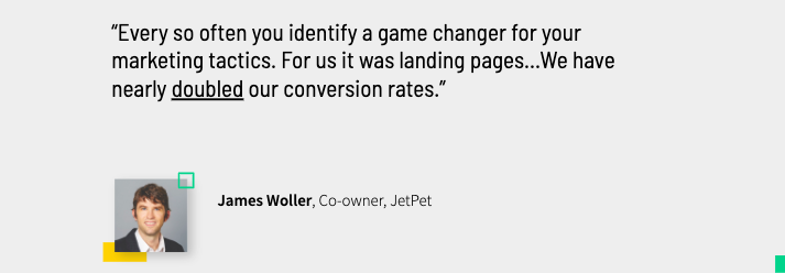
Example Of Well Executed Multi-Step Form: JetPet

JetPet is a Vancouver-based dog boarding school. When you click their ad you get taken to the Unbounce-built landing page above. The form on this page has a total of five fields that need to be filled out but breaks them out into a two-part form, as shown below. Now let’s talk about everything this form does right.
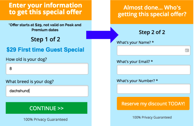
- They’ve minimized the perceived effort in signing up for the service. There is a psychology behind this set up that removes a lot of friction from this action. People are happy to tell you their dog’s names, and are more likely to finish what they start so there is now an added incentive to completing the form.
- They’ve delayed asking for more “sensitive” questions. It starts with two easy questions. The form waits until part two to asks for more sensitive information, at which point you’re more invested.
- They let you know how far along in the process you are. This is good for transparency because it shows they will be asking you more questions, and also shows visitors there is an end in sight as they work their way through the form.
- They are providing a really good offer. You should always provide good incentive for people to fill out your form, in JetPet’s case they are offering a discount on their services.
So what are the results of this form? Step one converts at 21-percent, and step two converts at a whopping 50-percent. Not too shabby!
How to Use Video on Your Landing Page (in a Useful and Contextual Way)
Video on a landing page can be very useful, IF it is used correctly. Your landing page video needs to fully support the offer it’s paired with, don’t go pairing an explainer video on a webinar landing page.
“I would never pair Oreos and Hummus together as a snack. And you shouldn’t pair a generic brand video with what should be a hyper-specific landing page.” - Jennifer Pepper
Example of a Successful Landing Page Video: Greats
The video below is on a page featuring a luxury sneaker offer and it's all about the Great’s sneaker, specifically.
It’s 15 seconds, it’s engaging, it speaks to their craftsmanship, and talks to EXACTLY the offer being made. Don't you feel at least a little interested in this shoe?
Dr. (Jennifer) Pepper’s Video Tips
- Test Thumbnails With People’s Faces - Decide what emotion your video’s trying to evoke, and exaggerate this in your thumbnail for higher play rates.
- Dynamically Pull Someone’s Name Into Your Thumbnail - Fun fact! Using a script, you can pull a viewer’s name into a thumbnail. When Unbounced tested this, a personalized thumbnail got 14-percent CTR, and non-personalized 9-percent.
You can learn how to personalize your thumbnails in this Unbounce article! - Make Offer Details Prominent Outside Your Video - Ensure your offer details are in the text on the landing page, not just in your video.
- Have Video Shrink and Follow Visitors on Scroll - This ensures someone can continue listening to the audio as they scan for more info.
You can learn how to add a sticky video widget in this Unbounce article!
You Must Match Every Visitor’s Search Intent, Exactly
If your visitor is going to convert, the offer on your landing page should be the perfect match for them. Personalization is a great way to do this, unfortunately, a lot of marketers struggle with personalized campaigns. This is understandable as you may not have enough data, or know what needs personalizing, and even if you did these kinds of campaigns are very time-consuming.
A quick shortcut out of this hole is the use of Dynamic Text. By using Dynamic Text Replacement, you can swap out text, magically with search terms. So if a visitor searched ‘blue shoes’, this is exactly what they’ll see from ad to landing page.
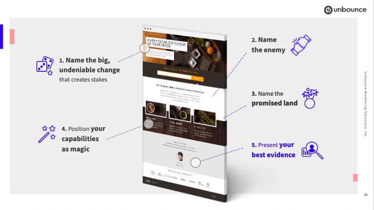
Implementing the Drift Storytelling Framework on Your Landing Page
Use your landing page to tell a rich story that applies directly to the visitor.
This framework is not the best option for every page, but is a good exercise when you wireframe top of funnel pages for those who may not be solution aware yet. The Drift Storytelling Framework follows these five steps:
- Name the big, undeniable change that creates stakes for your visitor. This should be a problem they’d face whether or not your company was in existence or not.
- Name the enemy. In this section, you tell people what they shouldn’t be doing that they’re doing now.
- Name the promised land. This is where you tell people about what the world could be like. What changes will they see once they leave the old way behind?
- Position your capabilities as magic. This is where you present your product.
- Present your best evidence. In this last section, you present social proof.
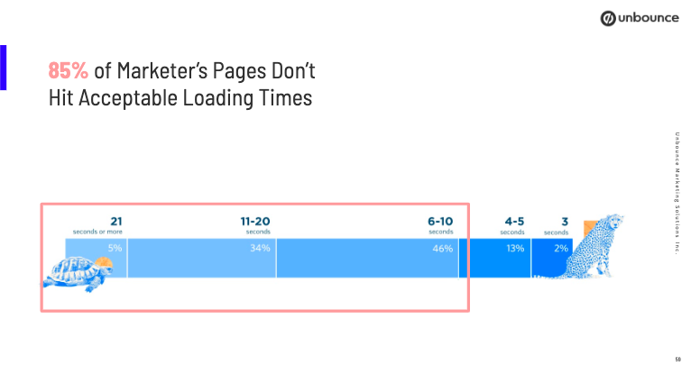
Do You Have The Need For Speed? Because Your Visitors Do
If your landing pages aren’t loading in 3 seconds or fewer, your content isn’t being consumed. - Jennifer Pepper
Slow loading times make visitors less likely to make a purchase, or even return to your website! And if they aren’t coming to you they are going to a competitor.
So what can you do?
- Compress your images, and even consider if any of them can be removed
- Pro Tip: Use a Free Tool to Shrink Images
- Try out Accelerated Mobile Pages. AMP is a Google-backed, simplified HTML framework with which you can build super slim and fast-loading landing pages.
Let’s Review the Ingredients in Our High-Conversion Soup
- Break down your forms
- Use video contextually
- Match your visitor’s search intent exactly
- Use some pages to agitate the problem
- Speed up your load times
And there you have it! Five key ingredients you need in a recipe for high-converting landing pages. Have more questions? Reach out to Jennifer Pepper and her team at Unbounce, they will be more than happy to help you reach your conversion goals!
Or check out their Landing Page Analyzer for a free personalized report to increase your conversion rates!
Looking for more resources? Try these on for size!
- Building A Better Landing Page: An Interview with Jennifer Pepper of Unbounce
- How to Host Video in HubSpot and Embed Them on Your Blog or Landing Page