In 2015, the number of mobile-only internet users exceeded desktop-only users. Additionally, Google championed responsive website design by judging how “mobile-friendly” a site is and using that metric to weight results served to mobile devices – affecting actual page rankings. Many companies scrambled this past year to be sure their websites were up to par in regard to Google’s mobile standards. For businesses who have not yet made the necessary website design changes that provide responsive design for multi-size device users, you may struggle to be found by prospective customers or lose them due to an inadequate experience.
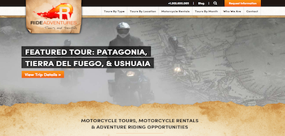
 In 2015, RIDE Adventures, a custom and private motorcycle adventure tour company, discussed a website redesign with Stream Creative. The redesign was considered not because their website wasn’t mobile-friendly, but because they knew they were not providing the best mobile experience possible. The company built a large list of tours in many different countries and wanted to simplify its search to make it easier for the mobile user to find a desired tour.
To simplify the process, we created a custom filtering system in the HubSpot COS using blog feeds and custom modules. The tour page design and tagging system features:
- Extremely customized blog templates.
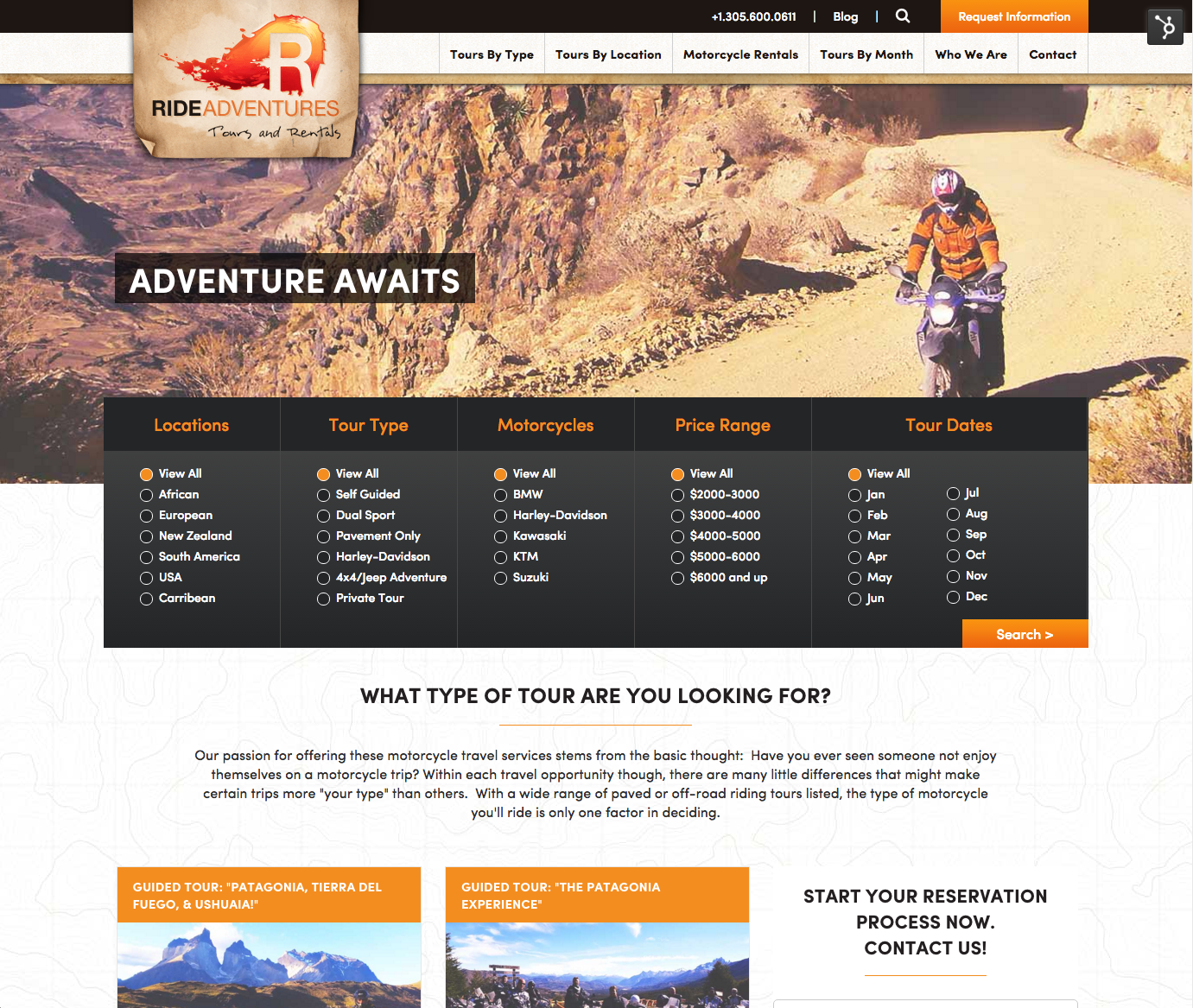
- On the “Tours by Type” landing page, the user has the option to filter tours by location, tour type, specific motorcycles, price range and tour dates. Rather than having to dig deep into each tour page for this info, the user now has the ability to find the tours based on their specific criteria.

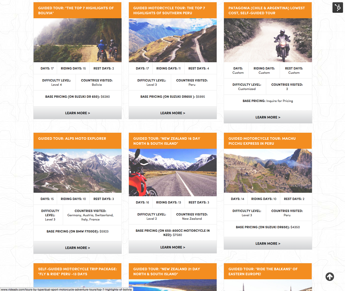
- Created custom card modules for each tour, providing users with quick information about each tour and an option to learn more.

- All tour pages and rental pages use specific tags to pull in motorcycles, tours and testimonials.
- Tour pages are based on custom blog templates we designed to contain all of the details pertaining to the individual tours. This gave RIDE Adventures the opportunity to explain everything a user would need to know about the tour.

- Tour / blog pages use custom fields and modules in the template that make it easy for RIDE Adventures to update and edit information for each tour.
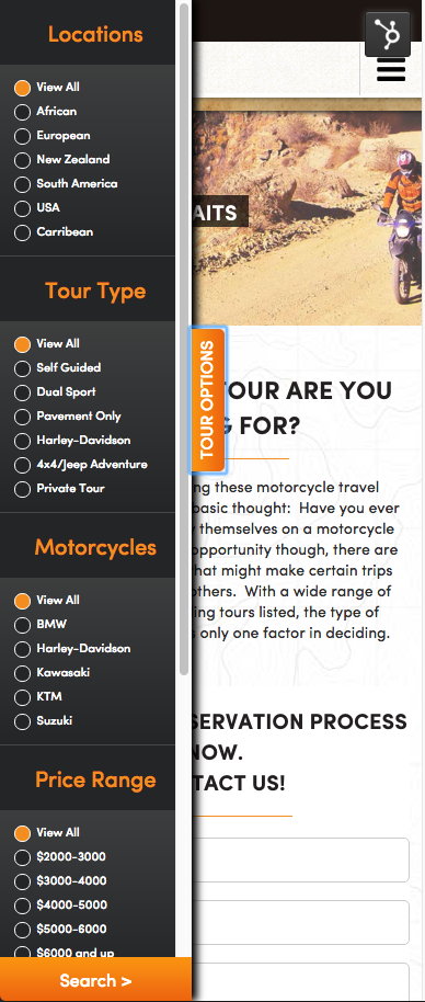
Tour search filter on mobile features:
- Designed a slide-out menu that gives the user the same filter options they would have on a desktop. This function is used on a few pages throughout the site.

Regardless of your overall goals or the audience you serve, offering a website that provides an impressive experience across different screen sizes will improve your business’ opportunity to be found and convert prospects. Content that can be accessed on one device must be available and presented in an easy and attractive way when they return on another device. This ensures consistency and the best user experience.


